Parmigiani Fleurier CEO Guido Terreni on how private luxury drives brand philosophy
Zach BlassRecently, I made a quick trip down to Wempe on Fifth Avenue in NYC to meet with Parmigiani Fleurier CEO Guido Terreni. Terreni is celebrated within the watch industry for his keen eye and attention to detail, notably serving as President & Managing Director of the Bulgari Watch Division from 2009 to 2020 – overseeing the period in which Bulgari became a much more serious player in watchmaking and in the eyes of watch enthusiasts. He would join Parmigiani Fleurier during the pandemic in 2021, and this chaotic and trying period ultimately became a wonderful opportunity for Parmigiani to be refined and rebranded. His leadership and guidance, and his influence on Parmigiani’s catalogue, was almost immediately apparent – and this is what I sought to hone in on while I had an hour of his time.

Interestingly, during our conversation, he cited Breguet as a major influence for Michel Parmigiani and Parmigiani Fleurier. Both brands are coveted by in-the-know watch lovers, but both brands suffered by their stringent desire to protect and preserve watchmaking of the past – their greatest strength and weakness being a strong foundation in tradition. What Terreni would walk me through, however, is how he navigated bringing a new style to the brand that could draw even more appeal without compromising the “private luxury” element that has made and continues to make Parmigiani Fleurier such a prestigious brand.
Zach Blass: First, I want to discuss the brand before you joined. From your perspective, prior to your arrival with Parmigiani Fleurier, can you give me an overview of where you believe the brand was? What was the strategy prior?
Guido Terreni: Well, when it came to life in 1996, it’s a brand that expresses a higher horology, high watchmaking in a very profound way. And this comes from Michel Parmigiani himself. Michel is a living legend of restoration. When you are a restorer, you are at the pinnacle of watchmaking savoir faire, because it’s not only a technical savoir faire, it’s also a cultural savoir faire. And you must remember that the historical moment in 1996 was more or less towards the end of the quartz crisis. It was coming to an end. So the knowledge of mechanical watchmaking was not as it is today. The ambition of Michel was to state what a true high-end mechanical watch is, done in a traditional way for an audience which is educated to luxury and to watchmaking.
ZB: So, Michel’s background in restoration provides a certain edge and advantage for the brand.
GT: Yes. The other ingredient that comes from restoration beyond this cultural and technical knowledge is the sense of understatement. Because when you are restoring, you are restoring somebody else’s creativity and in the interest of an end customer. So to give a second life to an object for the pleasure of the owner is the role of a restorer, and it’s to me fascinating how this skill, which is at the highest of the industry, your ego has to disappear because you should not leave a trace of your work. You should be able to reinterpret somebody else’s work in the manner that the original creator had, throughout these centuries, whether it’s a dial, whether it’s a case, whether it’s a movement – you have to know all the finishings and you have to know how to restore them. That’s why this brand is so deep and that’s why it’s so ostentatious because at the end, you’re not buying Parmigiani to showcase your wealth. You’re buying Parmigiani to have pleasure and have a high knowledge of what it is about. And this has always been there. That’s what made the brand so prestigious at the beginning.
ZB: And ultimately with the brand and Michel, and also being the mind behind Vaucher Manufacture Fleurier, it was a watchmaker-driven brand.
GT: I think first and foremost, it is a cultural exercise because you have to know that Michel is born in 1950, and then 25 years old. Imagine yourself at 25 years old – you have a passion for the art of mechanics, and you are looking at the world of watchmaking and everybody’s doing coarse watches. I mean everybody. When I say everybody, it’s everybody. And he started restoring watches because he felt that there was a cultural patrimony that was going to be lost. 50 years later, UNESCO names the watchmaking art or the mechanical art as a human patrimony. So without people like Michel, probably this wouldn’t have had happened. So that is another element of Michel, which is a very independent-minded person. So that’s again speaking to a connoisseur because you don’t buy a Parmigiani for the sake of social recognition. You buy a Parmigiani for a self-driven person, for your own pleasure. So that’s part of the soul of the brand.
ZB: Before we get to the era in which you’ve joined, one quick sidebar I want to take, because you’ve mentioned the words prestigious, and sophisticated. Of course, a very notable client of Parmigiani is King Charles.
GT: Of course.
View this post on Instagram
ZB: Do you have any insight as to how King Charles arrived at the brand? Because when you think about it, as you’ve said, it’s not meant to be an audacious sort of flex of a name that everybody necessarily knows, but it’s just knowing that you have something that’s very well put together.
GT: Well, I think it speaks to those people who are educated in luxury and who are able to discern what they’re seeing. If you are into the first decade of Parmigiani Fleurier from 1996 to 2004, there was a way of imagining watchmaking in a quite formal way, but very respectful of the tradition of watchmaking. And this was before the relaunch of Breguet, and Michel has an admiration for Breguet. Michel considered Breguet his master if you will, amongst many others that he had, but he had a deep passion for that style. And if you look at the first Torics, the etymology of the aesthetic of the first Toric is very close to the world of Breguet. That speaks to a certain public that is very private. I don’t like to talk about quiet luxury. I like to talk about private luxury.
ZB: I like this phrase, “private luxury.”
GT: I like to talk about private luxury because quiet luxury is a trend that is here now. And the next trend, I don’t know, we will dress all in orange. I don’t know what there will be. Private luxury, on the other hand, is here to stay and it’s always been there. And the true etymology of private luxury is personal choices – for your own pleasure, for your own education. So that’s what resonates to the public. And also his Royal Highness fits in very well in this.
ZB: So, when you arrived at Parmigiani Fleurier and became CEO, what had you identified as the strengths and weaknesses of the brand? What worked and what needed to change?
GT: When you have a pedigree of legitimacy like Michel was able to convey in the brand, you are already starting from very good point. It’s very difficult to gain prestige when you do not have it. But it’s very tough and different to reactivate a brand where, in the back of the mind of a connoisseur of watchmaking, the brand is already up there. I felt it was missing an intersection, a bridge that offered this past prestige with a style that would be more appealing to today’s customer. This is where these values of understatement, of private luxury, that I told you before enter the fold. It is very important to remember who is already attracted to the brand and the mastery of the know-how. These ingredients were the foundation of the relaunch, but I felt we would benefit from a new direction in style and in building up a collection that was able to express this prestige with a sensibility that would resonate better today. Again, the challenge was to do this in a manner that spoke to both past loyal clients and a new audience for the brand.
ZB: With such a quiet and classical sensibility to Parmigiani, is there still a concern regarding how the brand translates to a new age of consumers?
GT: When I joined, the brand had lost a little bit of contact from a stylistic point of view to the audience because the evolution of the taste in watchmaking these 25 years has changed. We are living in a less formal world. Watchmaking has taken steps to advance the way that you design a watch or you enjoy a watch. It’s also true that watchmaking became very big in terms of business, and it became more ostentatious, more loud in the way that you enjoy a luxury timepiece. So there was a need of connection to that original crowd that was very sophisticated, very independent, and it speaks very much to a young customer, to a young connoisseur, which is looking for personal points of repair in the industry. I think the pandemic accelerated this quest for an anti-mainstream kind of way of looking at luxury. When I joined, I was very pleased to play with this cultural content of the brand and to interpret it in a more fresh way.
ZB: Speaking of style, one thing that was immediately clear in this new era was a refinement of the dial. This refinement has led to a very cohesive collection. So can you walk me through how you arrived at the new era of Parmigiani dials?
GT: When you look at design, you have to understand which are the aesthetic codes of a brand, things that are recognisable and that are particular to the brand. So I asked that question to my designers, and it was interesting the response because you felt that there was an understanding of all the mechanics, all the finishings, but there was not an understanding of what is a structural ingredient of design. So I tried to express what I felt and studying the brand, studying its style from the outside. I picked few elements like when you bake a cake, you need certain ingredients.
ZB: What is one such ingredient that was brought into the mix? The logo revamp I imagine is certainly one example.
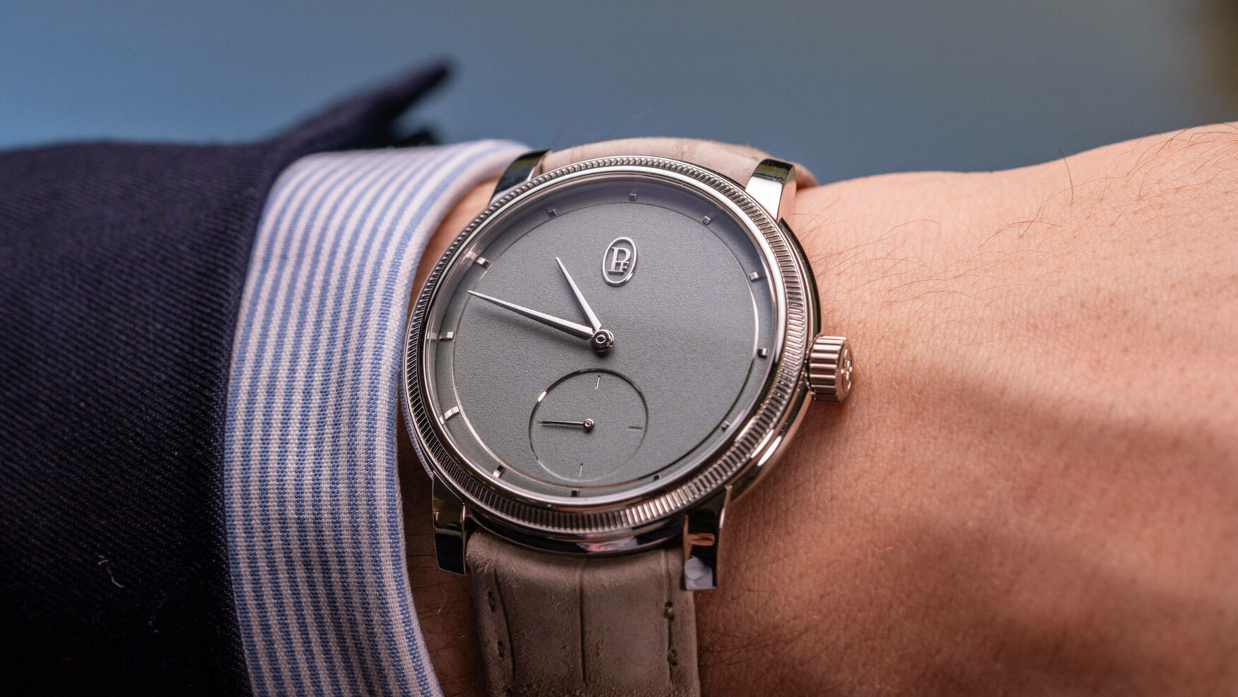
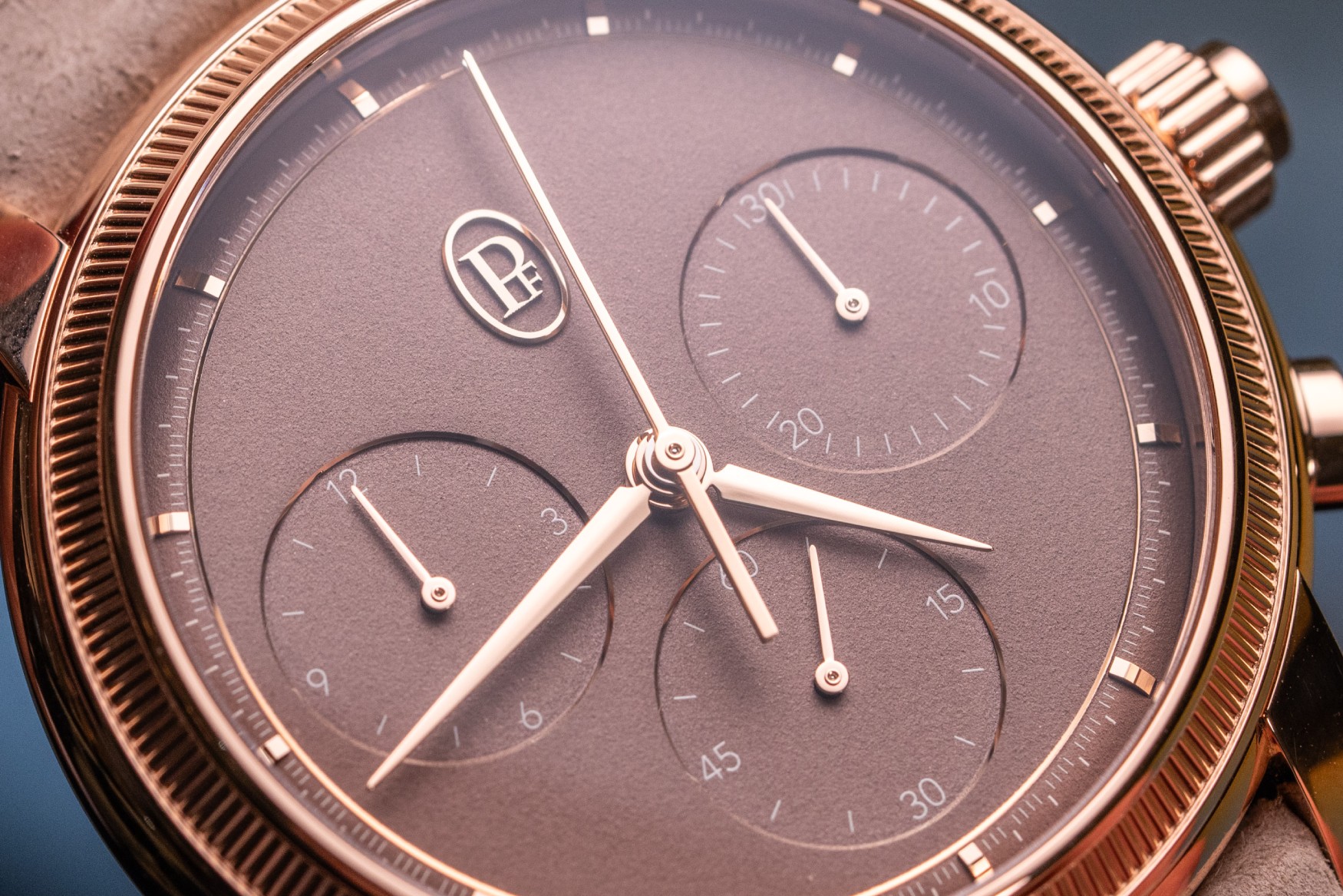
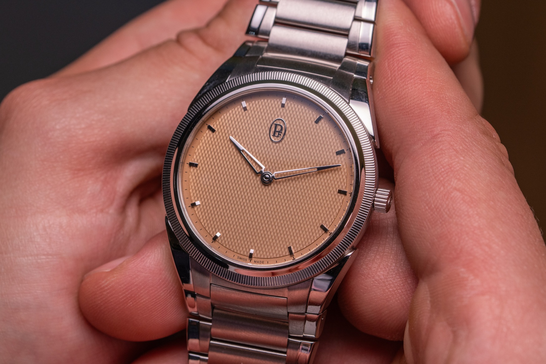
GT: The logo is a very important story because remembering the objective to please a customer, which is in itself its own pleasure, the logo is for the others. So taking out the lettering, taking out the writing Parmigiani Fleurier from the dial was a sign of attention to that private pleasure. And having this beautiful PF seal, in a perfect circle, an ellipse, which is a perfect ellipse because Michel, so it had to be very mathematical. You take a circle and you do an inclination at 30 degrees and you get that ellipse. That is the mathematics behind the shape of the ellipse. And that was a seal that was hidden in the brand.
ZB: What does the seal represent?
GT: It was born as a poinçon… A hallmark that identifies who fabricated the precious metal case for customs. And usually they’re not brands, they are case manufacturers who produce for other brands. So being an in-house production, the hallmark that Michel designed aesthetically was not simply putting just a ‘P’. He took the time to design something graphic and aesthetic. And then he put it on the oscillating mass, he put it on the crown, but not in more visible places. So by placing it at 12 o’clock, you are conveying the brand in a much more sophisticated way, yet in a less literal way.
ZB: Ironic how something previously hidden is now front and centre. Very cool.
GT: It’s subtle and I think it follows another category which is the car and automotive world that has long discovered that. Because if you think of a trident of Maserati, it’s much more nice than writing Maserati. If you think of the four rings of Audi, if you think of the star of Mercedes, I mean these are all logos that are graphic instead of being literal. Placing that on a dial makes a lot of difference in the sophistication of that.
ZB: What other ingredients would you say have been tweaked or fine-tuned?
GT: Another ingredient is our guilloché. The guilloché is part of the brand because we’re going back to Breguet, it’s going back to that mood. But guilloché is also a technique that is old-fashioned in terms of aesthetics. So I asked the question to designers, how can we make guilloché more modern, more contemporary? And it was by downscaling the pattern into a very minimal and small way that it became a texture that is not invasive to the reading of the dial. It became something that doesn’t disturb you. You see that texture in the craft. You see that richness, but it’s not invasive to the eye. It is there but is not there. The dosage of this is very important in a balanced design where you are looking for a purity without being too simple.
ZB: These tweaked aspects continued this essence of private luxury within Parmigiani Fleurier design, but in a fresh way.
GT: Exactly.
ZB: Now that you’ve introduced me to this idea of private luxury, it’s like a light bulb just went off for me. This idea that even the guilloché, it’s for the wearer, it’s not for everybody else. It’s not as overt because it’s a smaller pattern. It’s not something that you would see from across the room, but once it’s right in front of you. Attention-grabbing, but not begging for attention.
GT: Plus, we were in the pandemic, so we had the free capacity to do this quite quickly because it was urgent to re-launch the brand. So we did the PF in seven months. And this is something incredibly unprecedented.
ZB: That’s a quick turnaround.
GT: I think it’s unprecedented, I cannot state it for sure, but it is very rare to see this born in seven months, with seven references. And so we had to move in parallel with certain developments. The dial was a very funny story because I said to the development team, “I would like a guilloché which is almost invisible, that is there but is not there.” And I was traveling at the time when the first prototype arrived and my head of the development called me and said, “Well, if you wanted it to be invisible, we don’t see it.” And the guilloché artisan was so proud because it’s done by hand and if you look through a loupe, you saw all the guilloché decoration and I said, “Well, you can’t invest that money into finishing and then not see it. No, we have to do it a little bit bigger.”
ZB: That’s really fine-tuning the size. Where did you ultimately land?
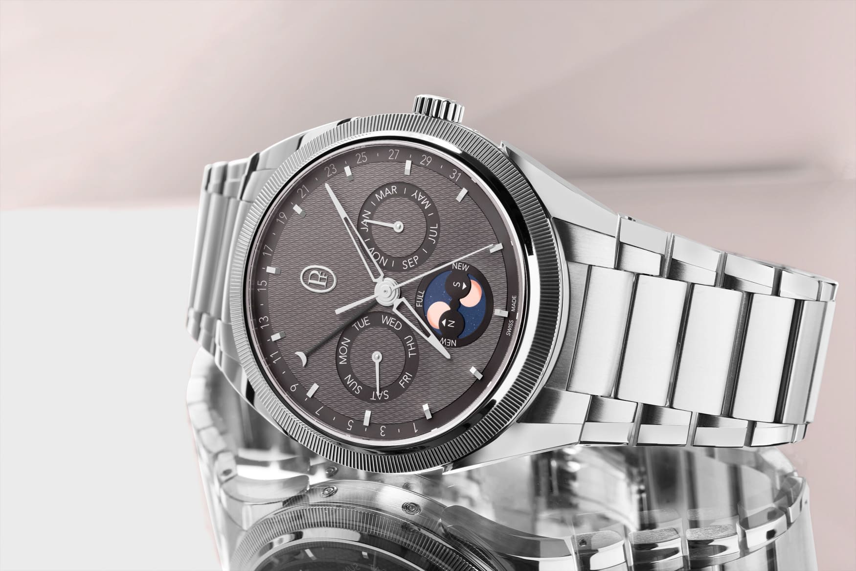
GT: So we had to launch three prototypes, one 10% bigger, one 20% bigger, and one 30% bigger because we didn’t have the time to do that in sequence. And so we ended up choosing the 10% bigger because the 30% was already going into an old-fashioned mode. The 20% was visible, but to me, it was a bit too visible. The 10% wasn’t visible enough, but I couldn’t launch a 15% because that was a bit of a manic thing. But then the funny thing was that we had only one anti-reflect treatment on the crystal at the time. So, we then put a second anti-reflective treatment on the bottom of the glass as well, with the 10%, and this worked for me. This is what you now see on our watches with guilloché dials.
ZB: I’m curious, as you were prototyping the size of the pattern, did you do prototyping with various colours to see? Because a darker or warmer dial will make the pattern feel more invisible right?
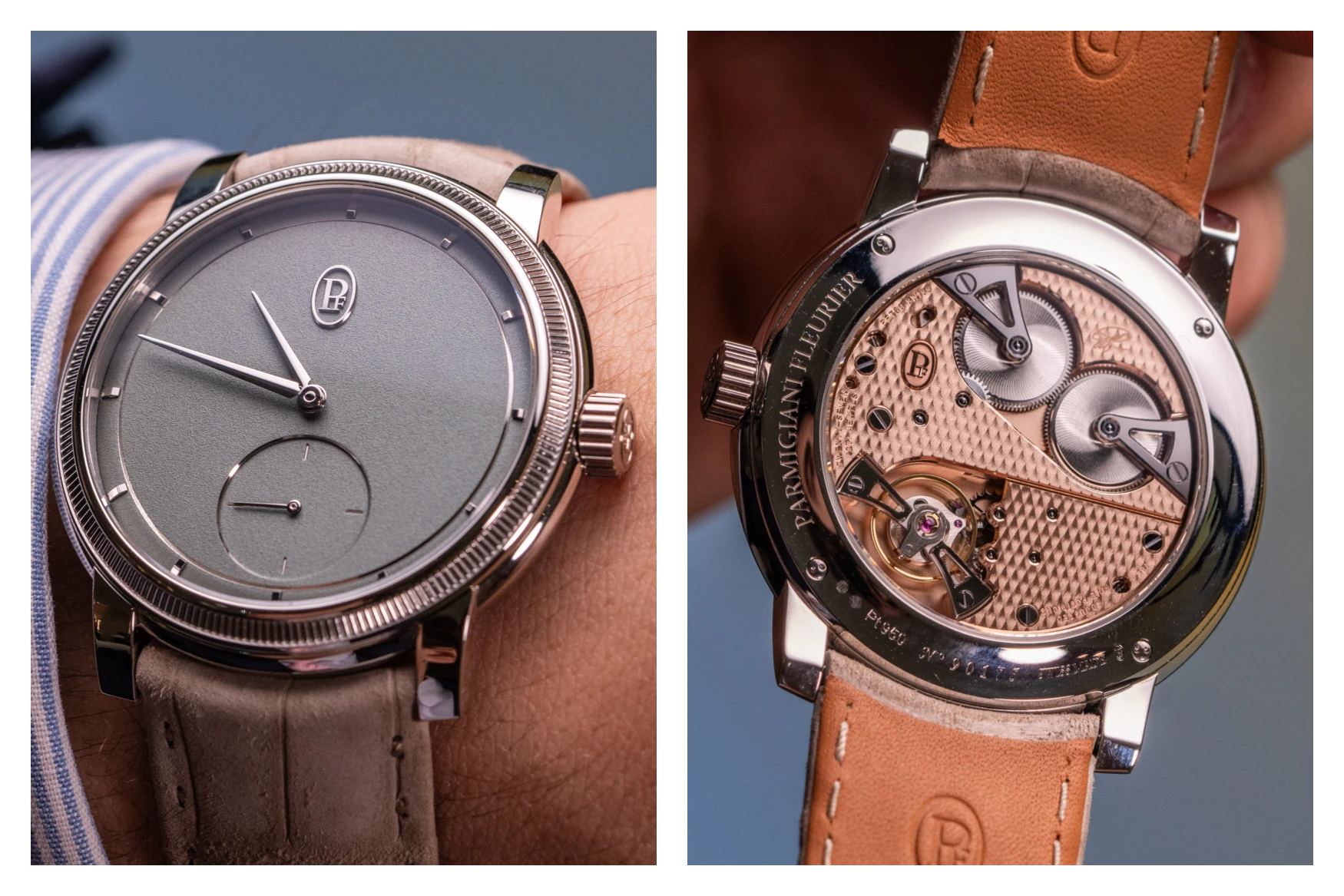
GT: It took three months to nail that warm grey. First of all, I didn’t want a blue one because it would be an evident reference to probably too many blue watches around. You don’t need another blue watch, but I think we needed an identity that was particular to us. And grey is a very common colour in watchmaking, but it’s cold. It’s without life. There’s black and white and you mix black and white, so it lacks an emotion. So we put in a little bit of brown in that grey to make it more emotional and the amount of brown can be nice or not nice. I don’t want to go into parallels. You can imagine that different grades of brown can affect the appeal. I think we prototyped three or four versions to get to that tone. And the same goes with the blue Milano, which is not a navy blue, so it is not a basic blue. It has some grey in it and it gives you a more sophisticated look on a blue. And then the palette moves towards brighter colours. Today you’re looking at the Golden Siena that we put on the Micro-rotor No Date as another example.
ZB: And presumably this colour philosophy extends to the Toric line as well.
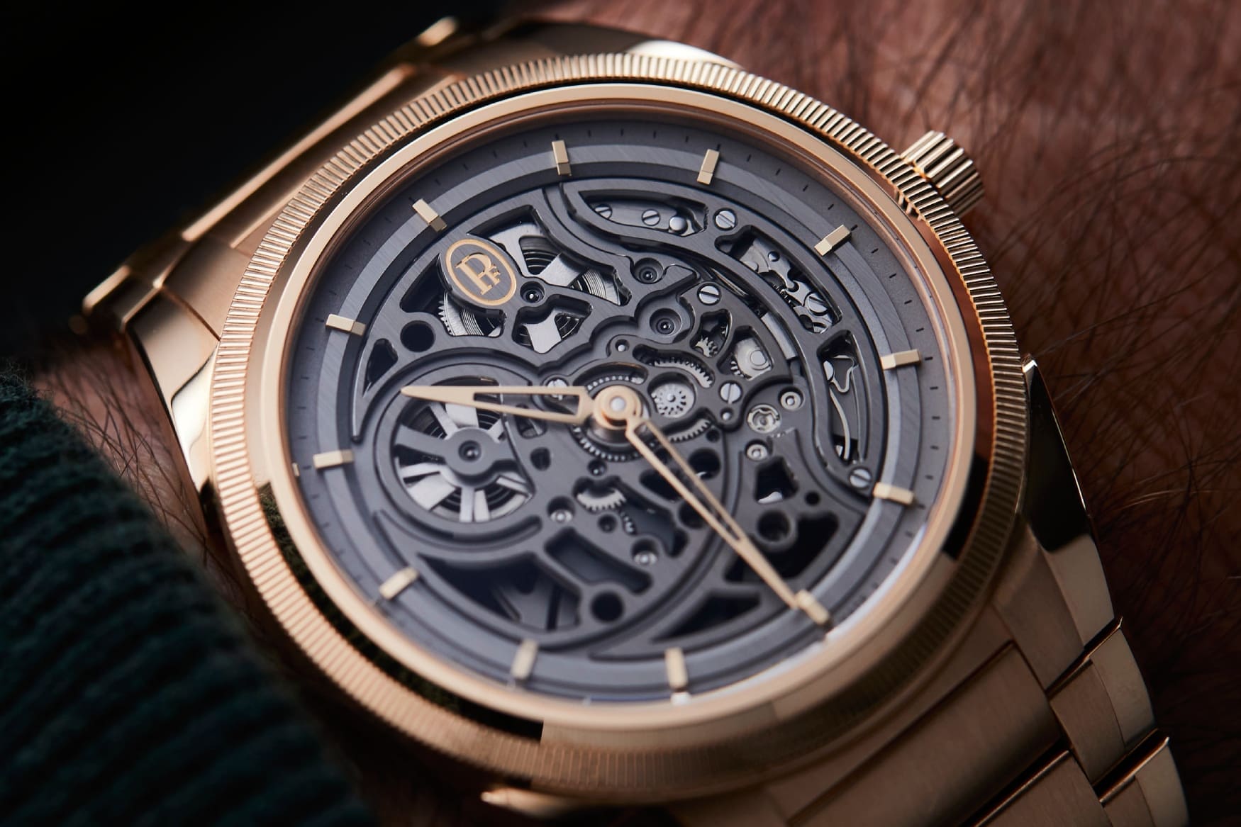
GT: On the Torics, it is a palette of colour that is inspired by a Swiss architect, Le Corbusier, which is at the basis of purism in architecture. He studied the colours that from a home perspective, from where you live, and clearly you can imagine that you cannot decorate your house or your apartment with flashy colours, so you have to have something that stays and you cannot decorate every six months because you’re fed up with what you chose six months ago. So these are colours that are very modern, but that palette of colours was defined in 1931. So it’s almost a hundred years ago.
ZB: Ah, very Parmigiani in that it is a classic sensibility with consideration for modern style.
GT: Yes. And when you look at that palette, you see how modern it is, you see how it beats time. We don’t take the colours literally from there, but it’s a source of inspiration if you want. And we try to tone down certain ones – you will never see a bright colour coming out from us. It can never be in your face. It has to be subtle, it has to be new, but it has to fit with what you’re wearing. It’s not an easy selection to find, to come up with a colour. And then you have to stick to it because once you develop it, it can be easy for the colour to shift, so we have bought a machine to control the palette so each one respects the original.
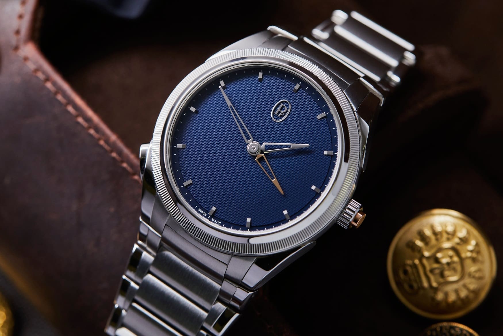
ZB: One little quick tangent, a personal favourite of mine from you is the Rattrapante GMT. I just want to make sure that I didn’t make this story up, but my understanding is that the hidden travel hand, the reason why it’s in rose gold, is that it represents the warmth of home.
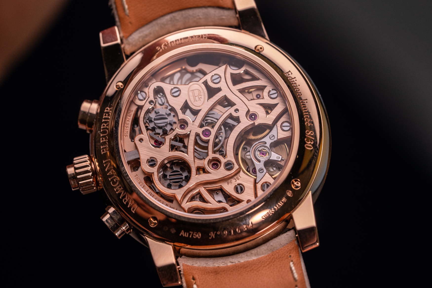
GT: Yes. Home is the most precious thing we have, and that’s why it’s in gold. And everything that separates from home is in white because the pusher is the colour of the traveling time, which is white gold, and the function back to home, which is the Rattrapante pusher that you have in the crown is in rose gold because that’s tied to home. You are going back to home. And even the micro-rotor is in gold because it gives life to the movement. So we chose to change from platinum to gold, the micro-rotor as well.
ZB: I love it. No detail without intention. I bring this up because I want everybody who sees or hears or reads this to understand that there might be brands out there that just go: “Let’s make it pink, let’s make it blue,” or whatever. But everything seems to be very precise and intentional when it comes to Parmigiani Fleurier. Nothing’s random.
GT: The most important question you have in luxury is why? Why do you do this? And we’re not there to sell another watch. We’re there to generate an emotion. Then the sale is a consequence. So the more you go into the why of things, I always say that you don’t need another watch in the market. There’s plenty. So if you want to launch one, you better have something to say.
ZB: Well, that’s certainly a mic-drop closing statement. Thank you so much for your time.
GT: Thank you Zach.


